Beautiful Error Bars in R
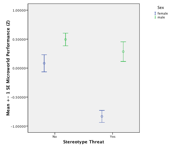
One of the reasons why I haven't made the switch from R to SPSS is R's lack of proper error bar graphs. I use them frequently because they are easy to interpret: If you plot the means of several groups of participants in one error bar chart and scale the error bars to a length of one standard measurement error, non-overlapping error bars indicate a significant difference between the according means. In fact, the APA advocates the use of error bars for reporting results since 2005 [1]. This way of reporting differences in means is also called "Inference by Eye" [1].
After my rants about SPSS, my wise R mentor, Stephan Kolassa, pointed me at the gplots library that features a good function for drawing error bars in R: plotCI(). Stephan also pointed me to Rseek.org, an excellent search engine for R related queries. I fiddled with Stephan's example code in order to reproduce my SPSS clustered error-bar chart from last week's post on stereotype threat in complex problem solving:
And this is how I got in in R:
 I like it very much; the only thing I need to work out is how to offset the bars in the same conditions so that overlapping error bars don't actually overlap but are drawn next to each other with a few pixels between them.
If you would like to try this out for yourself, here is the R code that produces the image above:
# Clustered Error Bar for Groups of Cases.
# Example: Experimental Condition (Stereotype Threat Yes/No) x Gender (Male / Female)
# The following values would be calculated from data and are set fixed now for
# code reproduction
means.females <- c(0.08306698, -0.83376319)
stderr.females <- c(0.13655378, 0.06973371)
names(means.females) <- c("No","Yes")
names(stderr.females) <- c("No","Yes")
means.males <- c(0.4942997, 0.2845608)
stderr.males <- c(0.07493673, 0.18479661)
names(means.males) <- c("No","Yes")
names(stderr.males) <- c("No","Yes")
# Error Bar Plot
library (gplots)
# Draw the error bar for female experiment participants:
plotCI(x = means.females, uiw = stderr.females, lty = 2, xaxt ="n", xlim = c(0.5,2.5), ylim = c(-1,1), gap = 0, ylab="Microworld Performance (Z Score)", xlab="Stereotype Threat", main = "Microworld performance over experimental conditions")
# Add the males to the existing plot
plotCI(x = means.males, uiw = stderr.males, lty = 1, xaxt ="n", xlim = c(0.5,2.5), ylim = c(-1,1), gap = 0, add = TRUE)
# Draw the x-axis (omitted above)
axis(side = 1, at = 1:2, labels = names(stderr.males), cex = 0.7)
# Add legend for male and female participants
legend(2,1,legend=c("Male","Female"),lty=1:2)
[1] Cumming, G., & Finch, S. (2005). Inference by Eye: Confidence Intervals and How to Read Pictures of Data. American Psychologist, 60(2), 170–180.
Labels: R, spss, statistics
posted by bertolt at 16:55
![]()

13 Comments:
Try defining an offset and then plotting with x values jittered by the offset, e.g.,
offset <- 0.05
plotCI(x=(1:2)+offset, y = means.females, uiw = stderr.females, lty = 2, xaxt="n", xlim = c(0.5,2.5), ylim = c(-1,1), gap = 0, ylab="Microworld Performance (Z Score)", xlab="Stereotype Threat", main = "Microworld performance over experimental conditions")
plotCI(x=(1:2)-offset, y = means.males, uiw = stderr.males, lty = 1, xaxt ="n", xlim = c(0.5,2.5), ylim = c(-1,1), gap = 0, add = TRUE)
I was slightly thrown by your using x to contain the means (which I would rather give to R as y values...).
Good luck with R! And thanks for the compliment :-)
I think that perhaps you would like to know that SPSS has a plug-in to access R programs from SPSS syntax files...
Or even more simply with ggplot2:
# I think this is a much more natural way
# of storing the data
df <- data.frame(
gender = rep(c("female", "male"), each = 2),
threat = rep(c("no", "yes"), 2),
mean = c(means.females, means.males),
se = c(stderr.females, stderr.males)
)
library(ggplot2)
# then the description of the plot is natural
qplot(threat, mean, data = df, colour = gender) +
geom_linerange(aes(ymin = mean - se, ymax = mean + se))
# Oops, I see you wanted errorbars and dodging:
qplot(threat, mean, data = df, colour = gender) +
geom_errorbar(aes(ymin = mean - se, ymax = mean + se), width = 0.3)
# and if you want them dodged side-by-side
dodge <- position_dodge(width = 0.3)
qplot(threat, mean, data = df, colour = gender, position = dodge) +
geom_errorbar(aes(ymin = mean - se, ymax = mean + se),
width = 0.3, position = dodge)
This post and the associated comments were very helpful - thank you!
Kinds of individual ugg rainier boots are cut from the ugg rainier skins which are sewn together by professional machines. The soles are glued to ugg boots upper. Now, you can purchase ugg ! uggs have stirred up a fashion tide and become a huge fashion craze. Enjoy UGG Australia comfort please!
I have some problems with that kind of bar on excel and open calc. It is hard to find a new program when you used to another program. but the only way it is to invest some time to know better the program that probably has the same feature.
Thank you very much.
Really great post, Thank you for sharing This knowledge.Excellently written article, if only all bloggers offered the same level of content as you, the internet would be a much better place. Please keep it up!
very helpful post, cheers!
Nice Blog! It was very interesting and informative. would like to say thanks for sharing it.
Hey, thanks a lot for this helpful script! I'm using it in a master's thesis, how would you like to be cited/referenced?
Thank you for such an informative article. You write well.
Post a Comment
<< Home